Today Not Tomorrow
branding, direction, & design
Anyone who has ever worked out with Rachel and Katelyn knows that they’re no joke. Looking to open their woman owned boxing studio in Missoula, they were looking for a brand that would resonate with their clients. Making note that procrastination and working out don’t exactly go hand in hand, they had the idea that the name should not only invoke a sense of urgency, but also communicate the power and explosiveness one is capable of when they dive head first day in and day out towards their goals. And so, TNT (Today Not Tomorrow) was born. A perfect mix of making every day count and hitting it as hard as you can.
TNT
Logo and Variations
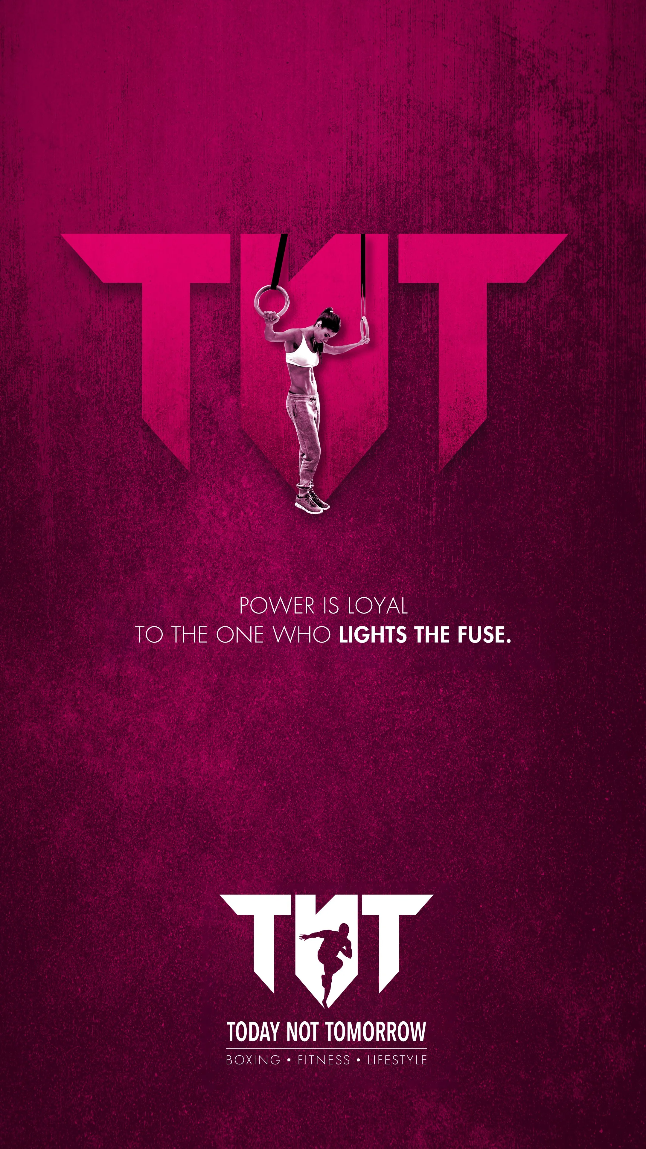
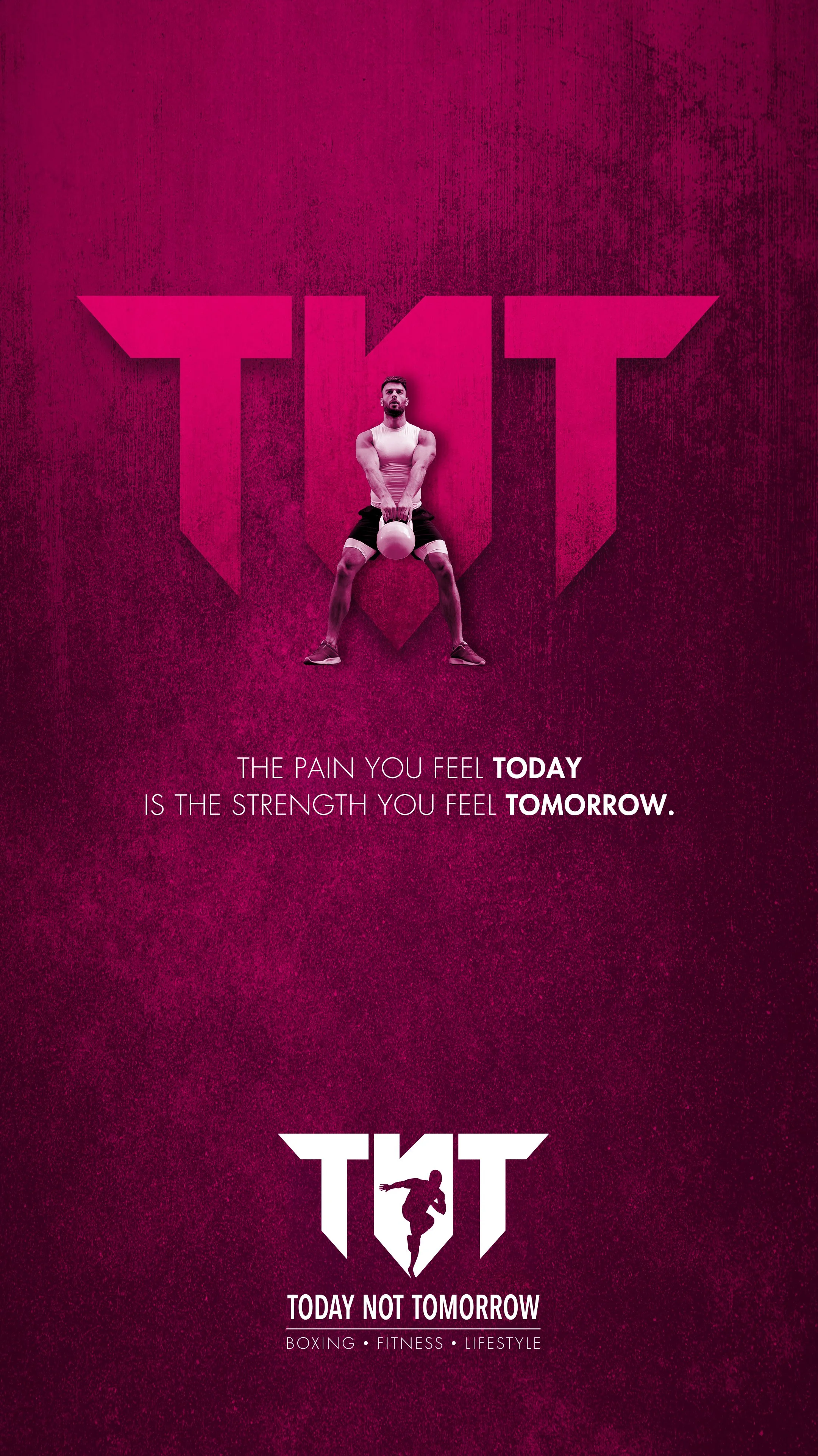
When creating the TNT logo, a sense of motion and explosive movement was desired. After multiple variations, what was decided on was a figure in the negative space of the N. This was beneficial in that as TNT continues to expand their offerings the figure can be swapped out to be more specific to the activity offered while still tying back to the overall brand.
Brand Flexibility
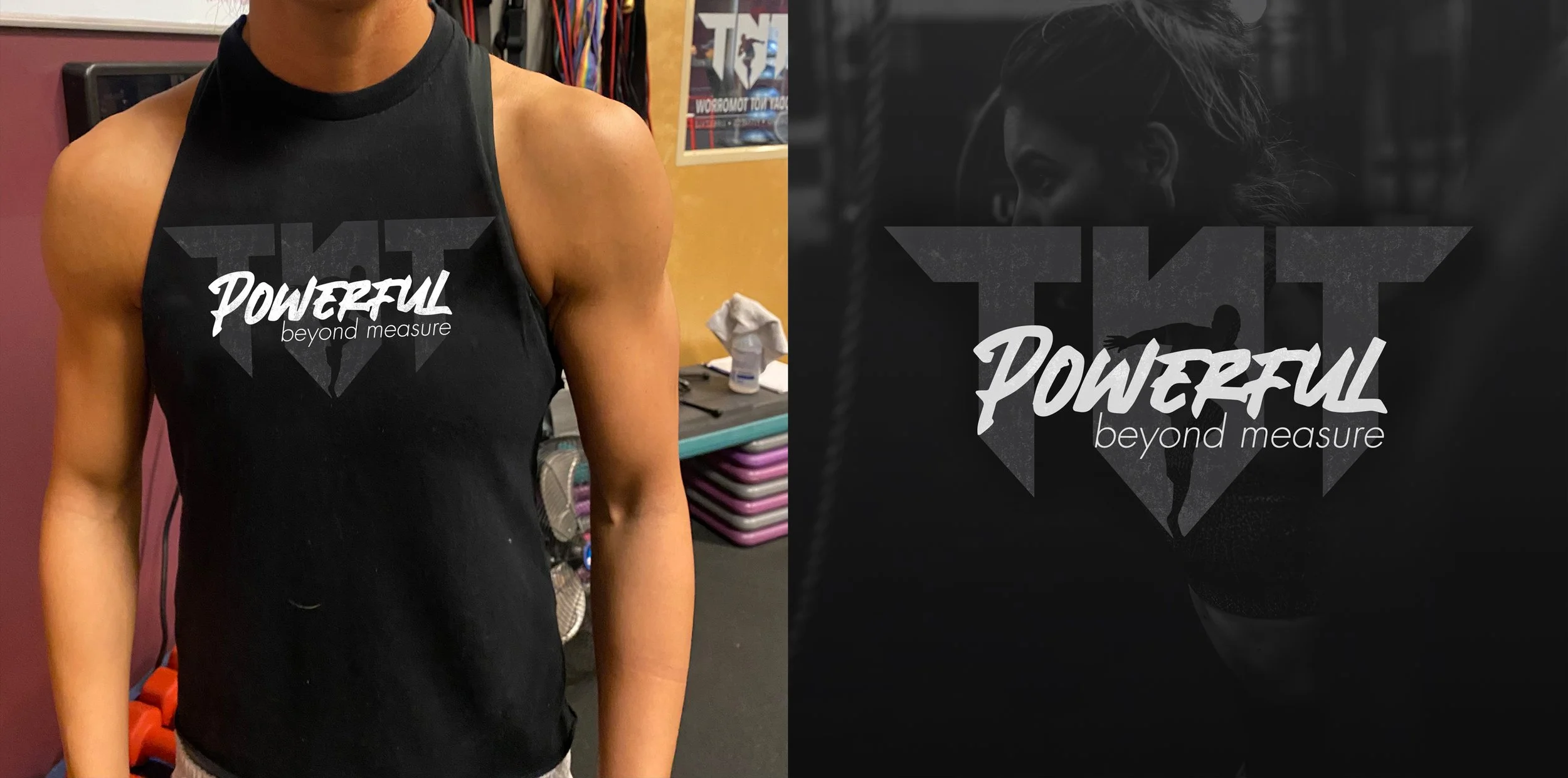
By making the branding for TNT flexible, it’s opened up opportunities for collaborations that otherwise would be difficult. As they continue to expand I’m excited to see what they come up with next.


